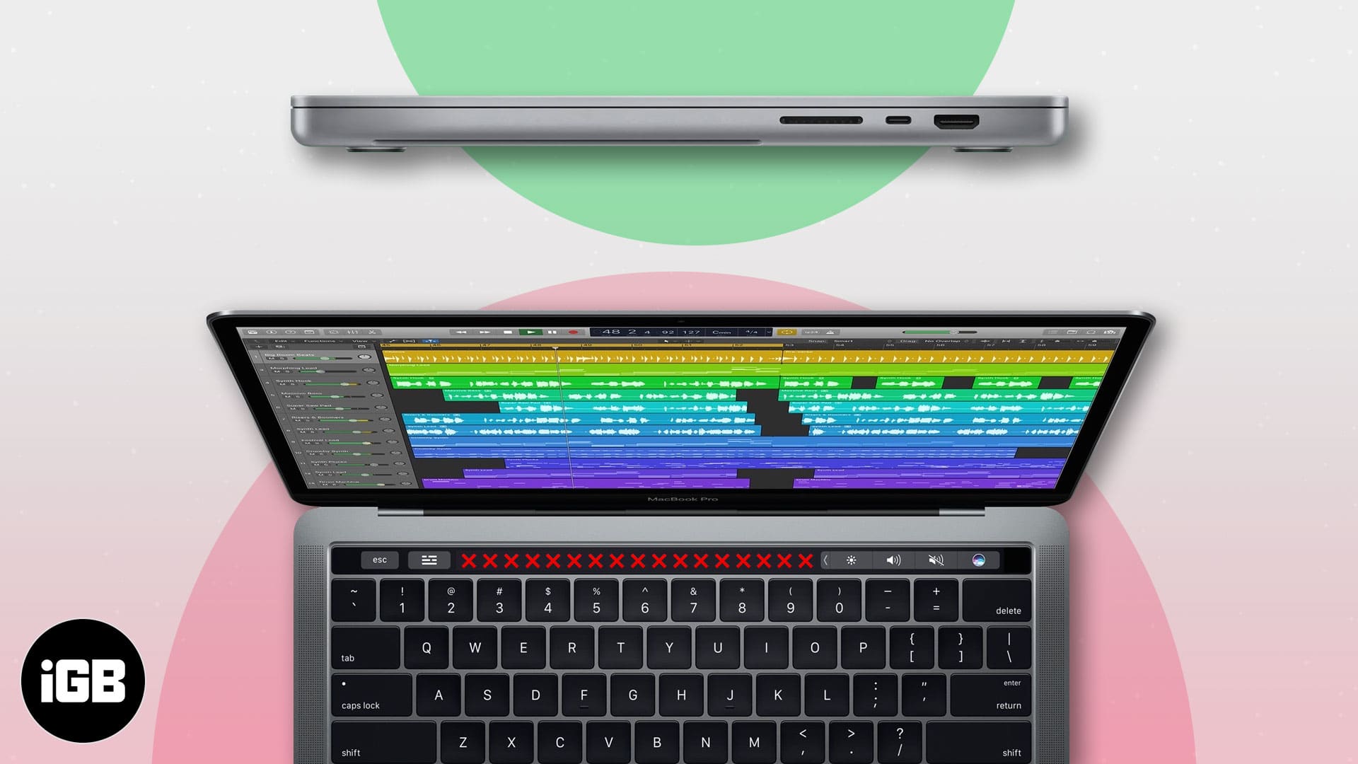
The 2021 MacBook Pro is a beast with M1 Pro and M1 Max chips, a mini-LED display, additional ports, and much more. However, the not-so-beloved Touch Bar is MIA. And while most users are open-heartedly embracing the change, my brain is buzzing with a few questions. Why did Apple remove the Touch Bar and add MagSafe and other ports in the 2021 MacBook Pro?

Well, I have some theories. Let’s start the discussion without further ado.
No Touch Bar in 2021 Mac: Is it good riddance?
Stringent steps like removing the floppy disk drive in 1998 and headphone jack in 2016 have been world-changing, proactive steps by Apple. Presumably, MacBook Pro with Touch Bar was one such attempt. But unfortunately, it didn’t turn out that way.
Ever since its launch in 2016, Touch Bar has been a controversial design inclusion. Users missed the function keys terribly, especially the ESC button, and never truly accepted the OLED strip. And finally, this year, Apple got rid of them.
It might have been a vision, but nobody got it?
On paper, it seemed like a brilliant and futuristic idea. Instead of function keys that are limited in their functions, Apple added a versatile touch-sensitive OLED bar; that could change and adapt to the application in use.

For instance, manage brightness or playback with a tap. And quickly launch favorite websites or swiftly switch between open tabs when using Safari. The Touch Bar boasted endless potential; if you don’t believe it, check out our explainer.
Amazingly, you could even customize the Touch Bar to show only function keys and act like any other laptop.

But then why did so many users detest Touch Bar?
Because, unlike Apple’s other bold moves, the solution did not sit well with users. Only a tiny niche got accustomed to it and are now sad to see it go. And everyone else constantly bitched about the feature and willed it to go away.
Moreover, while Touch Bar had potential, users found it limiting. Let me explain how.
Touch Bar vs. function keys
One massive reason users hate Touch Bar is the love for physical function keys. People have become so accustomed to that tactile feel that accepting a touch interface was difficult. The switch between tap and touch hinders your speed, especially in the beginning.
For instance, I am a fast typer (occupational hazard) and prefer using keyboard shortcuts over the trackpad, not breaking my rhythm. Now, Touch Bar didn’t fit well into that equation or function keys.

Thanks to habit, I didn’t have to look down from my screen and intuitively press the required function key combination. And that’s where Touch Bar failed terribly; even after months of practice, it didn’t come in handy.
I still had to peak at the OLED strip to adjust brightness and volume almost without fail. Then, there was missing support from apps. While some apps attempt to harness its power, most prefer to ignore the feature.
As a result, no one got to enjoy the touch screen’s real potential, and the oh-so-lucrative Touch Bar lost the battle against function keys.
The blame falls on Apple’s shoulder
The sole reason for Touch Bar’s failure is ignorance by Apple. During its launch in 2016, the Touch Bar was prominently featured on stage and in marketing materials. However, as It received some criticisms from the audience, Apple acted as a one-side mirror.
The tech giant introduced no interesting innovations or features. Besides, there were limited attempts to explain use cases or push developers to play with them. Instead of upgrading Touch Bar or attempting to improve its impression, Apple chose to ignore the situation for far too long.
Buttons are cheaper
Enhancing Touch Bar’s hardware and software was no small feat; it would have demanded some heavy investments. And introducing the familiar function keys sounds like a more economical option. But then, when has Apple ever shied away from expense?
Apple might never reveal the real reason behind it, but I am genuinely disappointed with the tech giant for ignoring Touch Bar for so long. Because a little TLC could have made the difference, see how apps like Apple Maps, Notes, and Reminders have grown over the years.
What do you think? Was it wise of Apple to ignore Touch Bar? But would you have accepted an enhanced Touch Bar over function keys? Share your thoughts in the comments section below.
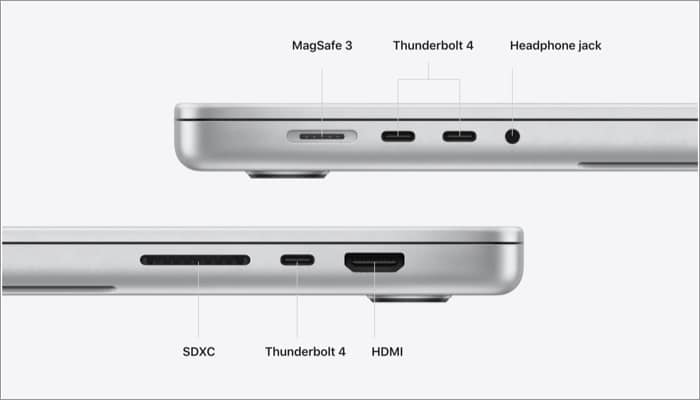
It’s a party with ports!
Now, this one is much straightforward to deduce. Users needed more ports. Apple gave them more. Although, is anything so simple with Apple ever? Users have been asking for more ports for ages, so why now? Moreover, what’s with the return of MagSafe?
But before we go on to that, let’s first take a minute to appreciate the new ports.
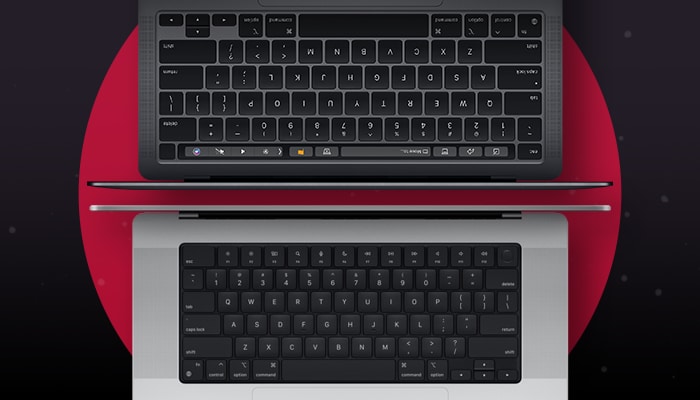
Before

After

The magic of multi-ports
Now, who doesn’t love more ports? After all, they open a whole new world of possibility, for instance:
- Two ways to charge – Apart from the MagSafe 3, you can also charge your device via Thunderbolt 4 (USB-C) port.
- Fast Charging – For the first time, you can fast-charge your MacBook Pro battery up to 50% in just 30 minutes with 96W USB-C Power Adapter.
- Attach more screens –
- M1 Pro – Up to two external displays with up to 6K resolution at 60Hz.
- M1 Max – Up to three external displays with up to 6K resolution and one external display with up to 4K resolution at 60Hz.
Harnessing the power of their strong chips
The apparent first conclusion to why Apple has added back the ports. While the M1 raised the bar, M1 Pro and M1 Max have thrown the ball out of the park. Some of the perks mentioned above can only be possible because of these new chips.
I know, Apple could have left it to dongles as it did before. But don’t you think it would have reduced or limited the performance and these numbers? But that still leaves one question.
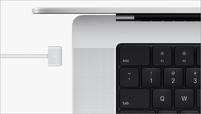
Why did Apple re-introduce MagSafe?
To be honest, I might need your help in resolving this one. My best bet is that MagSafe 3 was the most feasible and safest way to enable fast charging. I also feel that this is Apple’s answer to maintaining the industry-standard USB-C port while still maintaining its exclusivity.

While USB-C is fast, it is not the most reliable, primarily if you use third-party cables. Users tend to plug under-powered phone chargers, and that cycle needs to be discouraged.
MagSafe is Apple’s proprietary technique initially released in 2006 and phased out in 2015, and it was re-released in 2020, but in a different form in iPhone 12. Introducing it back into MacBook Pro can be a small step towards a big picture that Apple is building around MagSafe.
And maybe in the year 2028, I will be writing I told you so. Anyways, I love that MagSafe is back, low-key; I used to love that snap and missed it.
Limited ports tie the user’s hand
The title will resonate with everyone, whether you are a student or a professional. Apple ecosystem is already restricted due to privacy, and this two ports system further irritated users. Additionally, they started to detest Apple for that.
Especially users with pro setup. They need to attach/remove so many accessories at a given time, and the lack of ports slows them down.
So, either Apple finally listened to its users. Or maybe it received way too many requests for dongles during the whole work from home scenario, which led it to empathize with other users across the globe.
Dongles aren’t the finest solution
Ok, so which dongle do you own, and how much does it cost? An excellent hub for MacBook Pro starts somewhere around $250 – $600. And if you compromise with price, charging and data transfer speed are affected heavily.
And while the price might not be the thought process Apple had while bringing more ports onboard, performance is essential for them. Especially with the new chips, they would love their users to harness the full potential instead of compromising with a substandard dongle.
Mistakes are meant to be corrected, isn’t it?
Not all cards are Aces. Apple has its fair share of failures, from butterfly keyboard to AirPower, and now Touch Bar joins the list. The new M1 Pro and M1 Max Mac is a machine for pro users; it is obvious that Apple would listen to them.
What’s great is that now budgeted users don’t have to worry about investing in dongles. There are certainly lesser restrictions in terms of connection and way more possibilities.
Well, these are my two cents on the matter. What do you think? Share your thoughts in the comment section below.
In love with your Mac? Let us strengthen this relationship with these articles:

