Apple’s biggest boon is its futuristic approach. Unfortunately, that’s also its curse; hear me before any judgment. Apple often overlooks minute details/features in its farsightedness or extravagant feature list. This hampers the overall user experience and irritates users to the core.
Whether you consider this my wishlist for iOS 16 or some foolish hopes, here’s a list of basic features I wish Apple would introduce soon. Features that might seem too small; but have the power to greatly enhance the OS.
1. Turn off camera access from the Lock Screen
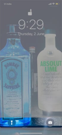
Yes, it is convenient, but why can’t it be my choice? The camera and flashlight access from the Lock Screen is a smart idea; you don’t have to waste time unlocking the phone.
Plus, when using the camera from the Lock Screen, you can’t view the iPhone’s camera roll, ensuring your privacy. Undoubtedly, the feature is great, but haven’t you ever accidentally and irritably enabled the camera or flashlight.
What about that toddler parent, who has unlimited clicks of their child’s nostrils, or a heated phone due to the flashlight with a low battery. The feature is for our convenience, so why can’t we simply enable/disable it as per our convenience?
It’s not just the fictional parents or me; we get many queries about how to disable the camera from the lock screen. And users do get irritated that it is not an option (see the comment section of that article).
2. Predictive dialer for iPhone’s app
A galore of customization options are lacking in iOS. I understand the logic behind some, but some just stump me; why do we not have that? A simple example is the missing predictive dialer. When we start typing a contact’s name, a list of options pops up.
Why can’t that be applied to the keypad? When we key in a number, a list of suggestions can pop up. Agreed, the GenZ might not be number aficionados, but iPhone is also used by boomers and millennials. Some people still like remembering a number’s first/last digits and would love to dial like that.
Furthermore, the previously dialed number can be prompted when dialing an unsaved number again. Now, wouldn’t that be convenient? What’s more, Apple can make this a choice. Users can go to Settings and toggle it on/off, depending on whether they want a predictive dialer.
3. No ending point for the hourly reminder
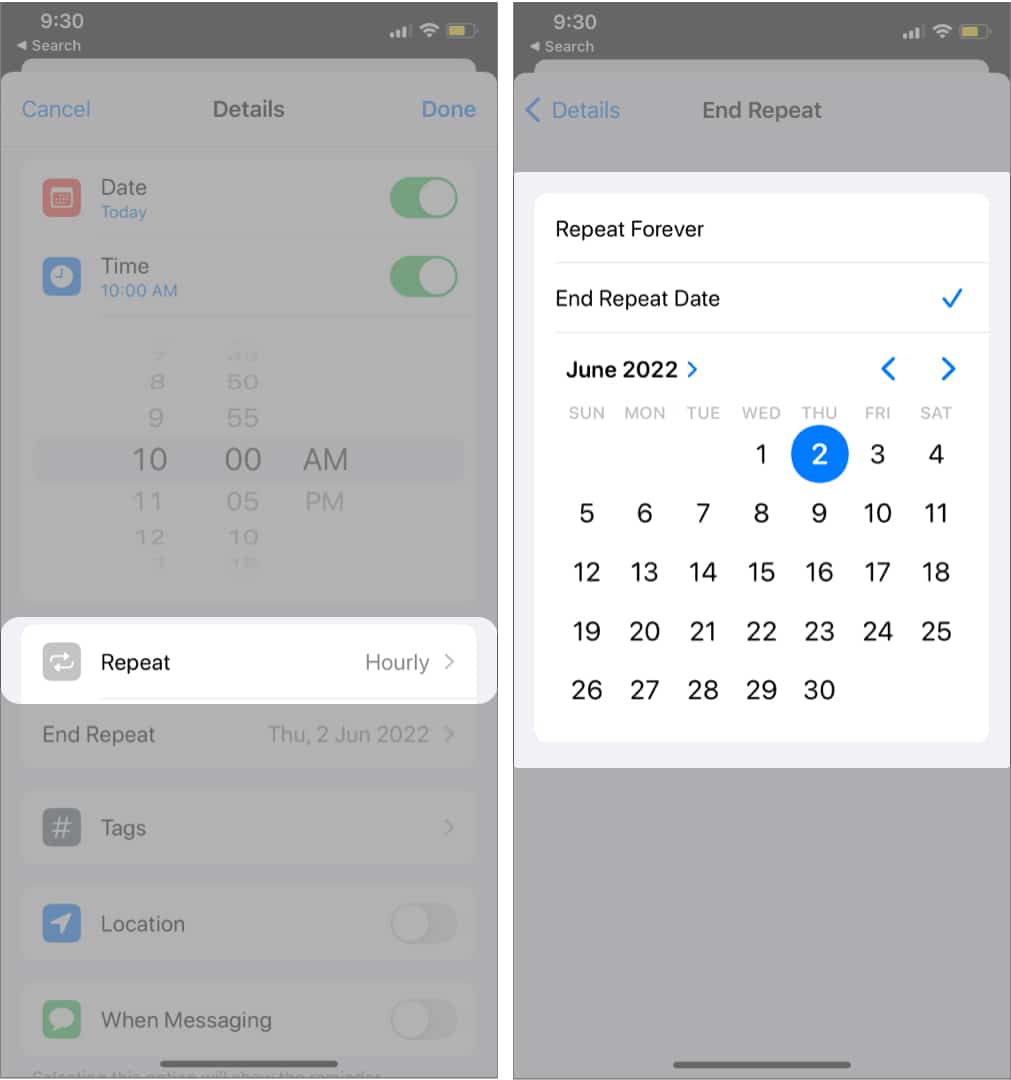
This one is equal parts funny and irritating. Firstly, Apple takes ages to incorporate an hourly reminder system into the Reminder app. Then it suddenly removes the feature in one update and brings it back randomly in a later update.
While we’re happy that Apple decided to keep that feature in the mix, why isn’t there an off switch to it? So you can set an hourly reminder and the time from when it should start, but not a time when it should end.
I discovered the missing feature due to a user comment. And I even tried playing with the Automation to turn off the hourly reminder at a fixed time/location. But that’s not a very user-friendly solution.
I don’t know why, but it seems that the developers at Apple don’t want us to keep an hourly reminder; unless we use a third-party app.
4. Different volumes for different notifications
When you adjust your device’s volume, the sound of every notification, whether a call, message, app alerts, etc., follows suit. We can debate whether this feature is really required or not. But all I am asking from the developers is to give users a choice.
I want the phone to ring loudly, messages a bit less, and alarms to go off loud, while reminders should just have a ping. And you may want something similar or entirely different, but what we get is the default. I hate to say it, but Android users get the choice. Why can’t iOS users be privy to it?
5. Can’t share Wi-Fi passwords manually
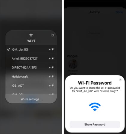
I love how Apple’s ecosystem can connect multiple devices with features like AirDrop, Wi-Fi password sharing, etc. With so many Macs, iPads, and iPhones running wild in the iGeeksBlog’s office, these features help us a lot, but only if they work smoothly.
It is cool that a message automatically pops up on your Mac/iPhone/iPad for sharing a Wi-Fi password. And all you have to do is tap/click Share Password.
However, you don’t have any control over the setting. The message usually pops up 8 times out of 10, so what about the other 2 times? How difficult would it be to incorporate a setting that will allow users to request a password from other users?
And if you’re scared of users being bombarded with password requests, give a switch to disable password sharing or contact-only settings like AirDrop.
6. View saved Wi-Fi passwords
What’s even a bigger sore point to the above situation is that you can’t simply go and check the Wi-Fi passwords! You’ll have to follow a series of steps to view saved Wi-Fi passwords before you can manually share them with others.
You can create a QR code and stick it to your router’s back as an alternative. But why should one go to such lengths?
7. Battery status on the Lock Screen
iPhones with notch do not carry battery status on the status bar. If users want to check the battery percentage, they’ll have to open Control Center or battery widget. In both scenarios, the user has to unlock the iPhone.
Wouldn’t a widget or battery percentage icon on the Lock Screen (like the Focus icon) be a better way of accessing these details? And as per the theme of this article, the user can choose to enable/disable the setting for privacy or other concerns.
8. Just view camera photos in the Photos app
The Photos app is quite deft, and Apple has been making sound changes. However, one key feature is still missing. You can see all photos in the Library tab, including images you have clicked, downloaded, or received via any app.
Further, you also get several folders in the Album tab (selfies, screenshots, Live Photos, WhatsApp, Instagram, etc.). Although, oddly enough, there is no option to see just photos or videos clicked from your camera. Agreed, it’s not that big a deal, but wouldn’t it be more convenient if we had that option.
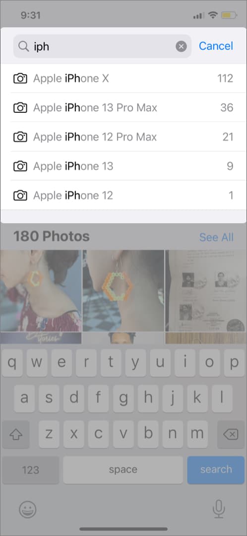
Note: I have a trick up my sleeve for this issue; go to the Photos app → Search tab → type iPhone in the search bar. You’ll see a list of iPhones; select the one you want to view.
9. Not easy to spot Burst or Live Photo in the Camera Roll
When viewing the Cameral Roll, you can easily spot a video via the time stamp. However, the same courtesy is not extended to Burst and Live Photos. You can spot the Live Photos and Burst mode icon when viewing them individually, but not while viewing everything together.
I must mention that Burst mode photos have a stacked-up look, but that’s only visible if you look too closely. I know that’s not a massive flaw, but since we’re on the topic, expressing my grudge against the issue is validated.
10. Apps stick to the grid on the Home Screen
This is one prick that iPhone users have been living with forever, while Android users are enjoying the perk. Apple is stringent over many things, and I understand the logic behind most of it, but not this one.
The iOS/iPadOS icons must follow a stringent grid for reasons better known to Apple. While we can move them around, we can’t place them randomly. Agreed, Apple loves and encourages minimalism and simplicity. But what if the user loves chaos, or their wallpapers only work when the icons are at the bottom.
On the one hand, it’s Apple’s iPhone, and on the other hand, it’s also Arshmeet’s (imagine your name) iPhone. So, the user should have a right to keep the Home Screen how they seem fit, as minimal or chaotic as they want.
Note: If you want to defy all rules and regulations set by Apple for Home Screen design, check out this step-by-step tutorial.
11. Custom App folders in App Library
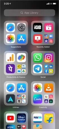
Another really important feature needed to truly customize our iOS experience. I was a happy bunny when the App Library was introduced in iOS 14. However, my excitement soon went downhill, as you can’t customize these folders.
So, the OS smartly arranges apps under the folder it seems fit according to what it learns from our usage. Although here’s the real trouble, as it does what it ‘seems fit;’ not what we might want.
Because while machine learning has become intuitive, it still can’t read our minds. Moreover, there are no foreseeable privacy risks if users want to arrange their apps in custom folders on their iPhones.
So, why the tech giant is not allowing these simple customizations is beyond me. All I can hope is that it realizes how stubborn and restrictive it is acting up and remedies the scenario ASAP.
12. Wireless OS recovery
Whether your iPhone is stuck on the Apple logo or disabled, the only way to recover the device is to put it in recovery mode and connect it to a Mac or PC (iTunes). But what if I don’t have access to Mac/PC now?
A wireless OS recovery will be highly appreciated in such circumstances. If there are any privacy and data-related concerns, we can handle them by adding a passcode or something. Or maybe the wireless recovery can be a safe mode version that runs the basic function until the Mac/PC recovery isn’t done.
I remember Apple briefly launching this feature in an iOS 15 beta, but that didn’t make it to the final public release. So maybe we might get it in iOS 16.
13. Snooze is stuck at nine minutes
It won’t move mountains, but when we’re on the demanding spree, why not ask for extra perks. There’s a whole story behind why Apple maintains a nine-minute snooze time, and I respect their sentiment.
However, I can’t help but question why limit it to nine minutes? Why can’t we get adjustable snooze time like many third-party apps and manage it as per our sleeping and waking habits? Oh, almighty developers, is it too much to ask?
14. No Split View on iPhone
While the multi-window support in other devices has been available since Android 7.0, I have not seen many people using it to its full potential. But the use case is not my point today, it’s the choice and the luxury to have that feature.
I am a Split View aficionado, and my Mac almost always runs split windows. Sometimes the other window would have nothing important, but it has become a deep-rooted habit for me. Naturally, I desire the Split View feature on iPhone as well.
Some may say the screen is not big enough, it will be difficult to manage two screens, and you don’t really need the feature. But I am managing the PiP mode and Reachability really smoothly. Let me have a shot at split screens and decide for myself.
15. Quick Note for iPhone
If not Split View, Quick Note might be the next best thing. Introduced in iPadOS 15 and macOS Monterey, the feature allows you to make super-quick notes and save links, photos, and more. And though we don’t have Apple Pencil and physical keyboard attached to the iPhone, using the Quick Note wouldn’t be that difficult.
In fact, it would be better than opening the Notes app, making a new note, and finally being able to type or paste some things. I am keeping my fingers crossed that we get the feature in iOS 16. What about you?
16. iPhone widgets need more functionality
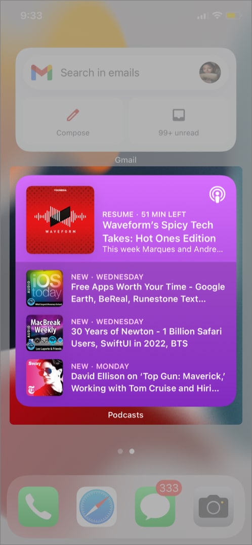
Let me start with an example of the Apple Podcast app widget. So, you can see the latest podcast episodes, but why can’t we pause/play it directly from here?
Yes, my AirPods can manage the pause/play while I am listening, but what If I am listening over a speaker or I was listening to Spotify and want to continue my podcast now? And the rant is not limited to this widget. I feel there is so much more real estate and chances being wasted.
17. Can’t lock folders manually
For a company that prides itself on its privacy-related policies and features, it is surprising that the process of password-protecting folders is so complex. Why can’t we simply use secondary click on Mac or long-press on iOS/iPadOS and select a password protection setting?
Shouldn’t it be that easy, Apple? Yes, we can use third-party vault apps to lock up your folders and files, but doesn’t that put our privacy at risk? Apparently, the developers at Apple don’t think so.
But hopefully, they’ll someday need to password-protect a folder and remember that they haven’t developed that feature.
18. Can’t see minimized windows in Mission Control
Mission Control on Mac is a cool and simple way to manage all active apps, windows, and desktops. However, funnily enough, you can’t see minimized windows when you see all of that.
And that’s a bit odd because the whole point of the feature is to allow you to see and switch between any and all active apps, except the ones you’ve minimized. This is the perfect example of what I stated in the intro: Apple is so concentrated on the bigger picture and better future that it misses the fine details.
If you’re reading this, Apple, I wouldn’t mind being on your payroll and pointing out these instances all day; but for now, I hope you’re enjoying this roast.
19. Need a smoother Split View system on Mac
As of writing this article, my Mac’s screen is split between two windows; Chrome with WordPress and the Notes app. And while I love Mac’s Split View to the core, there is certainly a chance for many improvements.
For starters, why can’t I drag and drop the windows to the side to invoke Split View (like on the iPad)? Why have that additional step of going to the green button and then select an option? Yes, there are Siri Shortcuts that I create and run to get a split-screen, but that’s also a step too long.
Multitasking on the iPad is much more intuitive; why can’t Mac adopt some tricks from it, especially the Multitasking Menu.
20. Smarter Siri
No matter which Apple device or OS you are talking about, this will be one feature on everyone’s wishlist. Despite being one of the oldest, Siri is still one of the most basic voice assistants. Don’t get me wrong, I am not age-shaming Siri.
However, Apple seriously needs to pull Siri’s socks up, way up. There have been some generous improvements over the years, but it is still too limited and slow in comparison.
And now that iOS 15 Siri has better on-device learning, access to on-screen materials, and can work offline, I have mighty high hopes for iOS 16 (keeping my fingers crossed).
Signing off…
Is there any iOS, iPadOS, macOS, watchOS, or tvOS feature that you think is lacking and needs urgent attention? Share them in the comments section below. We’ll pick the best ones and feature them in this article (with credits, of course).
Looking forward to hearing your take. And hoping that you enjoyed this rant ride and agree with me that these features need some TLC from Apple developers.
Enough bad press. Here’s are some amazing features you should surely try:

