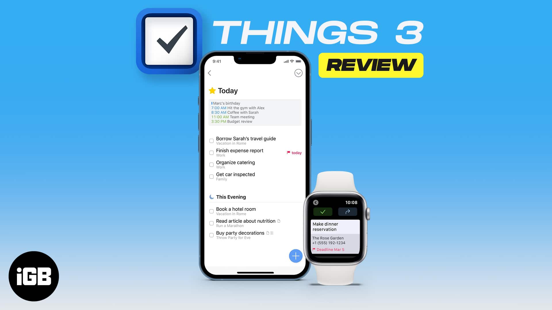
Things 3 is a to-do app with minimal UI, smooth organization, and smart features at its core. However, it is also missing some potent features. So, I’ll call this one a near-perfect app.
Pros
- Simple, clean UI
- Easy to use
- Cool features like reminders, tags, Mail to Things, etc.
- One-time cost, no subscriptions
Cons
- No web app
- Lacks collaborative features
- Individual purchase of each app
Price: Starts at $9.99 | Download
There is no such thing as the perfect task management app, or is there? While many YouTubers are going gaga over Things 3, I’ll stick to my skepticism until I thoroughly test the app. So, why delay? Let’s thoroughly test and review Things 3 and see how it measures up in my iGeekometer.
What am I looking for in Things 3 – For me, a good to-do app should have the right balance of a simple UI (how intuitive and easy it is to use) and advanced features (what it does and how good it does that). So, I’ll be majorly exploring/judging Things 3 on these parameters.
Things 3: Make things happen with this fine to-do app
Things 3 is a personal task manager designed to help users achieve their daily and long-term goals. As per the creators of Cultured Code, ‘Design Is not an afterthought;’ they wanted to make the app as user-friendly as possible while incorporating powerful and useful features.
And from my first, second, and fifteenth impression, they have done a good job. Things 3 packs smart organizational tools interlaced with a minimal yet impactful UI.
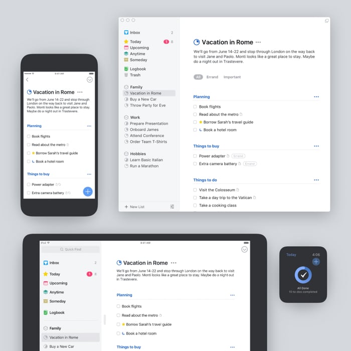
It beautifully digitizes the paper-lists system without any pompous attempt at fancy animations, cartoonification, or color-coding. So, your time is invested in doing the tasks and not in organizing or beautifying the task list.
The universal UI
Things 3 offers 3 apps – iPhone and Apple Watch, iPad, and Mac. What I love the most is that the user interface remains largely the same. So the move from device to device is fairly smooth.
Yes, the varied screen sizes are considered while organizing the tools. For instance, the sidebar becomes the homepage on iPhone and is just a left-swipe away, but nothing that’ll hamper your workflow or overall experience.
However, I should mention that Things 3 doesn’t come with a single all-access pass. All three apps are sold separately and priced differently. Depending on the use case and budget, you can choose one, two, or all three apps.
Things 3: Features you’ll love
My praises for Things 3 UI are not done yet; it flows directly into the features section. Let me show you how.
Simple yet effective organization
A neat thing about Things 3 is that it is structured quite well. The app is neatly divided into sections (and the possibilities of endless subsections), so you get a clear overview of the tasks at hand and priorities.
Basically, you get to organize your tasks in two manners. One by deadline/priority and the other by the project. I will try and explain each section with some examples so you have a better understanding.
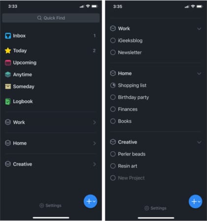
When is the task due:
- Today – I have to hand this article to publishers by EOD.
- Evening – Tasks that need to be done today but can be done later.
- Upcoming – Need to create two troubleshooting guides by the end of the week.
- Anytime – Brainstorm ideas for an upcoming newsletter scheduled to start by the end of June.
- Someday – Plan a trip to Bali (collect all resources and itinerary plans here).
- Logbook – Tasks of the past, check back when the task was completed from my end.
Where does the task belong:
- Areas – Whether the task is related to work, personal, household, holidays, health, etc.
- Projects – A subset of areas that further segregates the tasks. For instance, the Things 3 review is a project I am handling for work. And the project/plan for a surprise birthday party for my husband will go under personal.
Now, you can create as many subtasks as you like under the projects. You can also add notes to tasks, like reference links or things to remember. Each project boasts a completion percentage circle that fills up as you complete tasks under the project.
Thankfully, you can collapse down the areas/projects menu and hide the long list of tasks. It is not only great to avoid confusion but also helpful in keeping that overwhelming feeling at bay.
Note: Both styles of view are seamlessly synced with each other. The lists auto-pull task deadlines from projects and align them accordingly.
This saves you the effort of checking each project’s deadline. Furthermore, if you’ve not finished a previous task, it stays in Today view until checked off.
The magic is in the when
If just writing tasks were enough, I would be the master of multitasking. Although, remembering to do them at the right time is where the magic lies. And Things 3 can help you do that sorcery.
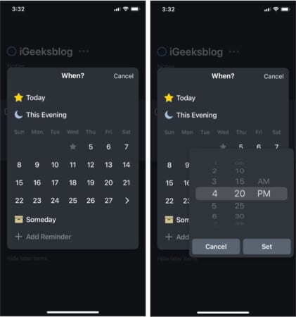
When scheduling a task, you can choose a deadline and reminder. That’s right; Things 3 smartly segregates between the two. So, you’re not just relying on seeing a task list, but you’ll get alerts (if selected) before the deadline, allowing you plenty of time to tie the bow neatly.
More than just to-do lists
Things 3 just doesn’t end with creating a checklist; on the contrary, it starts with it. You get:
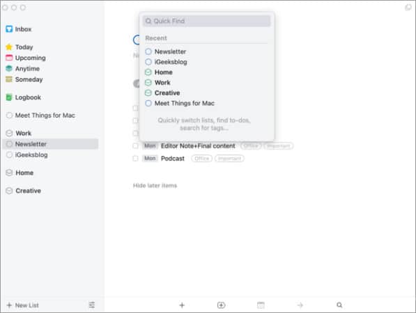
1. Quick find
You can search a project, to-do, or tags across your Things 3 account from any project or list page. Swipe down the page on iPhone and iPad to get the search bar.
On Mac, it’s even simpler with the Type Travel feature. Start typing anywhere (except the text data fields), and the search bar will open up.
2. Inbox
Taking a page from the Getting Things Done (GTD) book, Things 3 provides a space where you can add tasks and notes without worrying about organization or deadlines. Perfect space for random thoughts you need to pan out later.
3. Tags
Add a tag or label to indicate whether the task is important, errand, or both. You can filter a task by its tag or prioritize/deprioritize tasks as required.
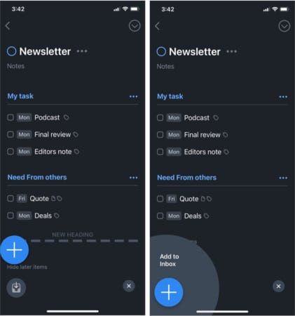
4. Magic Plus
You can simply drag and drop a task or project to rearrange them on every device. But the iPhone incorporates a blue-colored Magic Plus button. A menu opens up with options to create a new to-do upon tapping it.
Plus, you can hold, drag, and drop the + icon to create a new project, task, or heading. You can also directly create a new to-do in Inbox by dragging and dropping the + icon over the Inbox icon that appears on the left-bottom of the screen.
5. Integration
Things 3 doesn’t boast a lot of integration (read the rant in the next section), but it can integrate with Apple Calendar to stay updated with the latest events, meetings, tasks, etc.
Furthermore, it is available on Share Sheet on iPhone and iPad, so you can create a task with any content, whether a message, email, or a website, by simply typing the share button and selecting Things 3 from the option.
6. Mail to Things
Another way to create to-dos from other apps or platforms is to send an email to the Things cloud. Your app will instantly reflect the new to-do, as the email’s subject becomes the to-do title and the body becomes its notes.
7. There’s more
In addition to all of the above, you can also avail the benefits of:
- Home Screen widget (iPhone and iPad)
- Smooth editing features
- Siri & Shortcuts Integration (Mac, iPhone, and iPad)
- Full Keyboard Support, including keyboard shortcuts support (Mac and iPad)
- Multi-window support in macOS
- Markdown Support
- Dark Mode
- Import tasks from the Reminder app with tags
Things I wish were better in Things 3
1. No collaborative features
I am unsure if this is a valid complaint, as the app claims to be a personal task manager, not a project management system. But I feel the lack of collaborative features; you can’t invite anyone onboard.
Other apps like Apple Notes or Reminders, Google Keep, Asana, and Todoist, readily offer such features. Imagine not being able to share a grocery list or travel itinerary with your partner or other participants.
In addition, it doesn’t integrate with other third-party apps, like Slack, Basecamp, Zoho, etc. You can’t import your past to-dos or export them if you don’t like Things.
2. No web app
I understand that Things 3 wants to stick to the Apple ecosystem, but why can’t they have a web interface? You can sync between devices with Things Cloud, so wouldn’t a web-based interface be more user-friendly.
Especially for someone who has Android or Windows devices or someone whose devices are locked by employers or schools.
3. Vacuum for advanced features
While a great feature-packed app on its own, a few things are missing in Things 3. For instance, location-based reminders as offered by Any.do or Toodledo.
And I know I appreciated that it’s not overtly colorful earlier, but wouldn’t it be great if tags could have color. Just like dark mode is not a compulsion, these customizations could be offered. Whether users need it or not is a different story.
4. An expensive affair
If you look at the bigger picture, Things 3 is not expensive, as you’re paying a one-time cost, no subscriptions. However, shelling out around $80 to get an iPhone, iPad, and Mac app sounds like a big ask.
You get a free trial for the Mac app; iPhone and iPad users don’t get the luxury. So, if I don’t have a Mac, I can’t test out Things 3? Another reason a web app will make so much sense.
Should you think about Things 3?
Things 3 is a super organized app; however, it misses the mark of being a perfect app by a very little margin. If you need a personal to-do app that works seamlessly with iOS and macOS, there is nothing better than Things 3.
However, it might not be as user-friendly if you work with a team or have devices outside the Apple ecosystem. So, it’s basically a battle between ease-of-use vs. collaborative tools; you’ll have to choose the one you want!
Price:
iPhone app – $9.99 | Download
iPad app – $19.99 | Download
Mac app – $49.99 | Download

